-
- About the New York Fed
- What We Do
- Communities We Serve
-
More About Us
-
At the New York Fed, our mission is to make the U.S. economy stronger and the financial system more stable for all segments of society. We do this by executing monetary policy, providing financial services, supervising banks and conducting research and providing expertise on issues that impact the nation and communities we serve.
The New York Innovation Center bridges the worlds of finance, technology, and innovation and generates insights into high-value central bank-related opportunities.

Do you have a request for information and records? Learn how to submit it.

Learn about the history of the New York Fed and central banking in the United States through articles, speeches, photos and video.
-
- Markets & Policy Implementation
-
- Reference Rates
- Effective Federal Funds Rate
- Overnight Bank Funding Rate
- Secured Overnight Financing Rate
- SOFR Averages & Index
- Broad General Collateral Rate
- Tri-Party General Collateral Rate
- Desk Operations
- Treasury Securities
- Agency Mortgage-Backed Securities
- Repos
- Reverse Repos
- Securities Lending
- Central Bank Liquidity Swaps
- System Open Market Account Holdings
- Primary Dealer Statistics
- Historical Transaction Data
-
- Monetary Policy Implementation
- Treasury Securities
- Agency Mortgage-Backed Securities
- Agency Commercial Mortgage-Backed Securities
- Agency Debt Securities
- Repos & Reverse Repos
- Securities Lending
- Discount Window
- Treasury Debt Auctions & Buybacks
as Fiscal Agent - INTERNATIONAL MARKET OPERATIONS
- Foreign Exchange
- Foreign Reserves Management
- Central Bank Swap Arrangements
- ACROSS MARKETS
-
- Economic Research
- U.S. Economy
- Consumer Expectations & Behavior
- Growth & Inflation
- Equitable Growth Indicators
- Multivariate Core Trend Inflation
- New York Fed DSGE Model
- New York Fed Staff Nowcast
- R-star: Natural Rate of Interest
- Labor Market
- Financial Stability
- Corporate Bond Market Distress Index
- Outlook-at-Risk
- Treasury Term Premia
- Yield Curve as a Leading Indicator
- Banking
- RESEARCHERS
-
- Financial Institution Supervision
- Bank Applications
-
As part of our core mission, we supervise and regulate financial institutions in the Second District. Our primary objective is to maintain a safe and competitive U.S. and global banking system.

The Governance & Culture Reform hub is designed to foster discussion about corporate governance and the reform of culture and behavior in the financial services industry.

Need to file a report with the New York Fed? Here are all of the forms, instructions and other information related to regulatory and statistical reporting in one spot.

The New York Fed works to protect consumers as well as provides information and resources on how to avoid and report specific scams.
-
- Financial Services & Infrastructure
-
The Federal Reserve Bank of New York works to promote sound and well-functioning financial systems and markets through its provision of industry and payment services, advancement of infrastructure reform in key markets and training and educational support to international institutions.

The New York Innovation Center bridges the worlds of finance, technology, and innovation and generates insights into high-value central bank-related opportunities.

The growing role of nonbank financial institutions, or NBFIs, in U.S. financial markets is a transformational trend with implications for monetary policy and financial stability.

The New York Fed offers the Central Banking Seminar and several specialized courses for central bankers and financial supervisors.
-
- Community Development & Education
-
Community Development
-
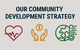
We are connecting emerging solutions with funding in three areas—health, household financial stability, and climate—to improve life for underserved communities. Learn more by reading our strategy.
The Economic Inequality & Equitable Growth hub is a collection of research, analysis and convenings to help better understand economic inequality.

The Governance & Culture Reform hub is designed to foster discussion about corporate governance and the reform of culture and behavior in the financial services industry.
Data Visualization
Community Credit: A New Perspective on U.S. Communities
